
A house in Toorak has a median of $4,960,000. A unit in the same postcode has a median of $970,000. The house costs 5.11 times the unit.
That gap is the whole sales pitch for buying a unit in a suburb you could never afford a house in. We measured it across 38 Melbourne suburbs and checked what those units actually did. Then we tested the fairest argument for buying them anyway: that a market which has gone nowhere has more room ahead of it.
Every one of the ten widest gaps has lost value for five years. The room-ahead argument does hold in Melbourne, but for outer corridor houses rather than these units.
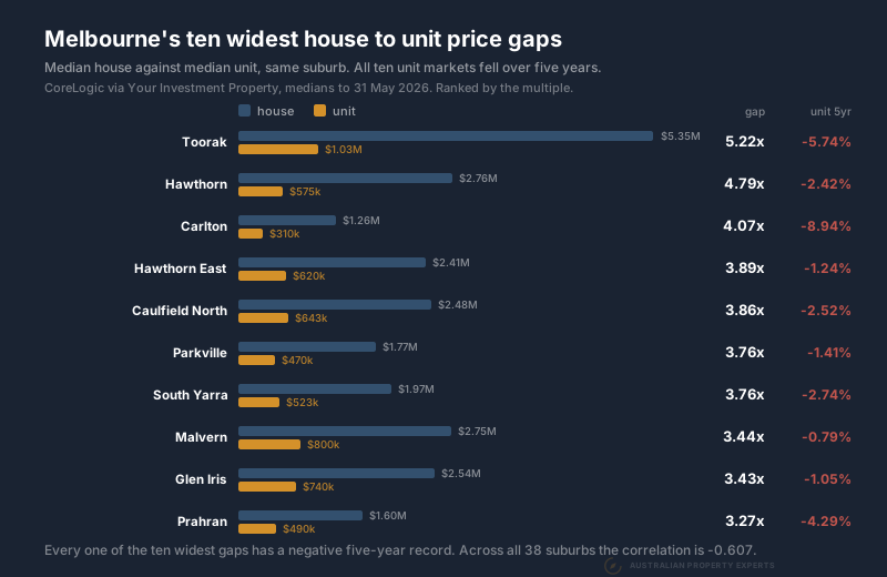
The ten widest gaps in Melbourne
Gap is the median house price divided by the median unit price in the same suburb. Growth is the unit’s average annual change over five years.
| Suburb | House median | Unit median | Gap | Unit 5yr growth |
|---|---|---|---|---|
| Toorak | $4,960,000 | $970,000 | 5.11x | -6.40% a year |
| Hawthorn | $2,650,000 | $582,000 | 4.55x | -1.49% a year |
| Hawthorn East | $2,410,000 | $608,000 | 3.96x | -2.21% a year |
| Carlton | $1,250,000 | $320,000 | 3.91x | -8.54% a year |
| Parkville | $1,768,444 | $467,500 | 3.78x | -1.22% a year |
| Caulfield North | $2,427,500 | $665,000 | 3.65x | -2.11% a year |
| South Yarra | $1,875,000 | $525,000 | 3.57x | -2.80% a year |
| Malvern | $2,700,000 | $785,000 | 3.44x | -2.93% a year |
| Glen Iris | $2,460,000 | $744,000 | 3.31x | -0.94% a year |
| Armadale | $2,295,000 | $701,000 | 3.27x | -2.58% a year |
Ten out of ten negative.
The ten narrowest gaps in Melbourne
Same 38 suburbs, the other end of the list.
| Suburb | House median | Unit median | Gap | Unit 5yr growth |
|---|---|---|---|---|
| Fitzroy | $1,512,500 | $805,000 | 1.88x | +0.12% a year |
| Preston | $1,212,500 | $630,000 | 1.92x | +0.32% a year |
| Hampton | $2,425,000 | $1,200,000 | 2.02x | +6.93% a year |
| Footscray | $950,000 | $470,000 | 2.02x | -1.77% a year |
| Coburg | $1,250,000 | $600,000 | 2.08x | 0.00% a year |
| Richmond | $1,350,000 | $633,100 | 2.13x | -0.98% a year |
| Port Melbourne | $1,580,000 | $740,000 | 2.14x | -0.33% a year |
| Ascot Vale | $1,350,000 | $627,800 | 2.15x | +0.41% a year |
| Brunswick | $1,300,000 | $600,000 | 2.17x | -0.75% a year |
| Albert Park | $2,397,500 | $1,100,000 | 2.18x | +5.17% a year |
Five of these ten grew and Coburg was flat. The average across the widest ten is -3.12% a year. Across the narrowest ten it is +0.91%.
What a wide gap does not tell you
A big multiple looks like a discount on a good address. Before treating it as one, be clear about what the number is.
The gap is a ratio of two price levels at one moment. It is not a measure of divergence. Toorak at 5.11 times is equally consistent with houses having run away and with units having fallen. We have not measured house growth here, only unit growth. So the gap shows the two markets are priced very differently, without showing which one moved.
The likely explanation is that houses and units here are not the same asset competing for the same buyer. A house price carries scarce land. A unit price carries whatever the apartment market in that postcode looks like. Where a suburb has expensive land and plenty of apartment stock, the two numbers drift a long way apart. That is a reasonable reading of the pattern rather than something this data proves. Testing it would need approvals and completions figures we have not put in front of you.
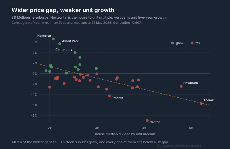
Across all 38 suburbs the correlation between the gap and the unit’s five year growth is -0.629. Wider gap, weaker growth, with plenty of scatter around it. Thirteen of the 38 grew over five years. Every one of those thirteen sits below a 3x gap.
Does flat mean it is due to run?
This is the fair objection. We act on it ourselves. A market that has gone sideways for years often has more room ahead of it than one that has already run. The value is there, nobody wants it, and that is frequently where a cycle starts. Victoria sits earlier in its cycle than Queensland or Western Australia. That is much of why we buy there at all.
A lower-priced market that has gone flat is often an opportunity. The hard part is telling it apart from a market that is still falling, because on a five year average the two look identical.
You can test it with one extra number. Put the last twelve months next to the five year average. A market that is turning has a recent year running ahead of its long-run rate. A market that is still going down does not.
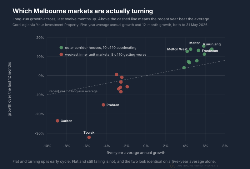
Run it across Melbourne and the answer splits cleanly by asset, not by price.
The outer corridor houses are doing what the early cycle argument describes. Nine of the ten we measured have a twelve month figure ahead of their five year average. Melton has averaged 6.11% a year and put on 16.49% in the last twelve months. Kurunjang 6.45% against 13.68%. Frankston 4.96% against 13.16%. Wyndham Vale is the one exception, at 3.39% against 3.85%. Melbourne’s overall dwelling values are still 3.9% below where they were five years ago.
The weakest inner unit markets are doing the opposite. Eight of the ten have a twelve month figure worse than their five year average. As a group they averaged -3.50% a year over five years and -7.72% over the last twelve. Carlton has averaged -8.54% and fell 17.95% in the last year. Prahran -3.90% and -10.91%.
Across all 38 suburbs the correlation between the five year record and the last twelve months is +0.710. So the markets that were weak have mostly stayed weak rather than bouncing back.
These markets can still turn, but the turn isn’t in the data yet, so buying now means betting on a recovery the numbers don’t show. If you want the version of this argument where the numbers have already started moving, it is the corridor houses, and they are more affordable.
Yield is the stronger warning
The yield is an even better warning than the gap. Across the same 38 suburbs the correlation between the unit yield and its five year growth is -0.679, stronger than the gap. High yields cluster where prices have not moved, because a yield rises just as easily from a stalled denominator as from a rising rent.
Carlton is the clearest case in Melbourne. Its unit median is $320,000 against a $1,250,000 house median, a 3.91 times gap. It rents for $570 a week, which computes to a 9.26% gross yield, the highest of the 38. Its units have fallen 8.54% a year for five years.
A 9.26% yield on a falling asset is the market pricing the asset, not offering you a bargain.
Carlton also deserves the caution this post gives everything else. A $320,000 median in a suburb of student apartments may reflect the type of stock that sold more than what the market is worth. Its 391 sales do not fix that. The five year direction is the durable part.
Where Melbourne units still grew
No suburb in the widest ten grew. The units that did are all at the narrow and middle end of the gap table.
Hampton has a 2.02 times gap and its units grew 6.93% a year, the best of the 38. Albert Park is 2.18 times and grew 5.17%. Canterbury is 2.42 times and grew 3.79%. Brighton is 2.61 times and grew 2.18%.
Those are bayside and eastern suburbs. The pattern is consistent with lower density unit stock behaving more like a house than a tower apartment does. Villa units and tower apartments both sit inside the same unit median, which is why the median alone will not tell you which you are buying. Two of the five strongest growth records in the set, Hampton and Albert Park, sit inside the ten narrowest gaps. Our screen of 153 Melbourne unit markets found the same pattern across the whole city.
What to check before you buy the gap
Check the five year average, not the last twelve months. Malvern units are up 9.41% over the year and down 2.93% a year across five. One of those is a trend and one is a bounce.
Check what kind of unit the median is built on. A block of six single storey villa units on their own titles behaves like a house. A 200 unit tower does not. The median does not tell you which one you are looking at. The sales count sometimes hints at it.
Check the sales volume. Canterbury’s unit median rests on 47 sales and Albert Park’s on 34. Those are thin. A thin median moves around for reasons that have nothing to do with the market.
Check the body corporate before you model any of this. It comes from the section 32 or the agent. On a high yield in a lift-serviced building, it takes a large bite out of the number that attracted you.
How Melbourne compares to Sydney
Across the 38 Melbourne suburbs here the median gap is 2.62 times. In the nine Sydney unit markets we measured, the median gap is 2.44 times. Every one of those nine grew over five years.
That is not a like-for-like comparison and we would not lean on the 0.18 between them. The Melbourne set is an unbounded blue chip and middle ring sample that includes a $4,960,000 Toorak house. The Sydney set was screened on unit medians under $650,000 in the west and south west. Different screens produce different ratios. What does survive the difference is the growth column: every Sydney market in that set grew and every one of Melbourne’s ten widest gaps fell. We covered the Sydney side in Sydney units under $650,000 and the yield side of the Melbourne story in Melbourne blue chip units and their yields.
We mostly buy established houses on decent blocks, because land is where the growth sits. Our guide ranks the best suburbs in Melbourne for houses. Affordable versus blue chip covers why the affordable end of a city has kept outperforming the premium end. The trade between the two numbers is in capital growth versus rental yield.
If Melbourne is the market, a buyers agent in Melbourne should be able to show you the growth record behind any unit before you look at its yield.
What the widest gaps have in common
The ten biggest house to unit gaps in Melbourne are all in suburbs with expensive houses and lower-priced unit stock. Melbourne house prices are in our market guide. All ten of those unit markets have lost value over five years. That is a strong association across 38 suburbs rather than a mechanism we have proved. There is real scatter inside it, too.
So treat a wide gap as something to explain, not something to buy, and settle it with one number. Put the last twelve months beside the five year average. If the recent year is ahead, the market is turning and the discount is worth having. If it is behind, the market is still falling and you could be waiting years for the turn.
Data sources. House and unit medians, weekly rents, twelve month growth, five year average annual growth and sales counts are CoreLogic figures accessed through Your Investment Property. Medians and growth run to 30 June 2026 and rents to 31 August 2026. The Melbourne five year dwelling change is from the Cotality Home Value Index to 31 August 2026. Because those dates differ we do not quote published yields, and every yield here is computed by us as weekly rent times 52 divided by the median. The gap is our own calculation, the house median divided by the unit median in the same suburb. Correlations are across all 38 suburbs measured. All figures pulled 26 September 2026.
This is general information only and not financial advice. Speak to a qualified professional before making investment decisions.
If you are looking at a Melbourne unit and want its five year record and its postcode vacancy before you commit, book a free discovery call.





_in_Melbourne.jpg)