We measured nine Sydney unit markets across the west and south west where the median sits under $650,000. Ranked on what an investor actually gets, which is the rent plus the capital over a full hold, they came out close to upside down. The three highest yielding markets filled the bottom three places. The two lowest yielding came third and fourth.
Nine Sydney unit markets under $650,000
Every yield here is computed the same way: weekly rent times 52, divided by the median.
| Suburb | Unit median | Rent | Computed yield | 5yr average |
|---|---|---|---|---|
| Mount Druitt | $470,000 | $490 | 5.42% | +5.01% a year |
| Liverpool | $532,000 | $530 | 5.18% | +1.25% a year |
| Blacktown | $535,000 | $580 | 5.64% | +0.23% a year |
| Lakemba | $540,000 | $550 | 5.30% | +7.14% a year |
| Merrylands | $541,000 | $610 | 5.86% | +0.45% a year |
| Campbelltown | $590,000 | $550 | 4.85% | +4.54% a year |
| Auburn | $600,000 | $650 | 5.63% | +0.51% a year |
| Bankstown | $605,000 | $620 | 5.33% | +3.37% a year |
| Penrith | $622,500 | $580 | 4.84% | +4.90% a year |
All nine grew. The same exercise in Melbourne produced the opposite result in every market we checked.
Rank them on total return instead
Take five years of rent at the stated yield. Add five years of capital at the stated growth rate compounded, and hold both rates flat. It is a rough model and it ignores tax, but it ranks the markets on the same basis.
| Suburb | 5yr rent | 5yr capital | Gross total |
|---|---|---|---|
| Lakemba | 26.5% | 41.2% | 67.7% |
| Mount Druitt | 27.1% | 27.7% | 54.8% |
| Penrith | 24.2% | 27.0% | 51.2% |
| Campbelltown | 24.3% | 24.9% | 49.1% |
| Bankstown | 26.7% | 18.0% | 44.7% |
| Liverpool | 25.9% | 6.4% | 32.3% |
| Merrylands | 29.3% | 2.3% | 31.6% |
| Auburn | 28.2% | 2.6% | 30.7% |
| Blacktown | 28.2% | 1.2% | 29.4% |
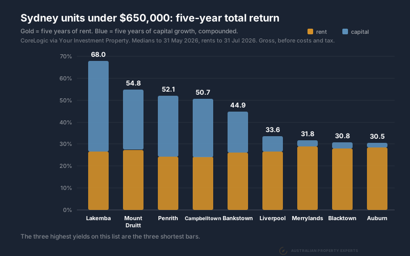
Merrylands, Auburn and Blacktown pay the three best yields on the page and fill the bottom three places, Blacktown last. Penrith and Campbelltown pay the two worst yields and finish third and fourth.
Rent was the steady part. Every market returned between 24.2% and 29.3% of it over the five years, a spread of 5.1 points. Capital ran from 1.2% to 41.2%, a spread of 40.0. It matched or beat the rent in four of the nine. Capital decided the ranking and yield barely moved it.
Why the top yields ranked lowest
A yield is a fraction. It rises when the rent goes up and it also rises when the price stops moving, and the two look identical from the outside.
Merrylands pays 5.86%, the best of the nine. Its median moved 0.45% a year over five years. Blacktown pays 5.64% on 0.23% a year, Auburn 5.63% on 0.51%. Those are the three best yields on the page and the three flattest price records. They fill the bottom three places on total return.
Lakemba pays 5.30%, about half a point less than Merrylands, on a median that grew 7.14% a year. Over five years Merrylands returned 31.6% and Lakemba 67.7%.
Half a point less yield came with 36 points more total return. We cannot tell you from this data whether Lakemba’s rent grew or its price simply ran. A yield level does not separate the two. What the growth column does say is which market moved.
Vacancy across the nine
Vacancy tells you whether the rent has support under it. SQM Research publishes it by postcode.
| Postcode | August 2026 | March 2026 |
|---|---|---|
| Penrith 2750 | 0.64% | 0.65% |
| Mount Druitt 2770 | 0.65% | 0.84% |
| Bankstown 2200 | 0.87% | 0.78% |
| Liverpool 2170 | 1.12% | 1.05% |
| Blacktown 2148 | 1.15% | 0.93% |
| Auburn 2144 | 1.20% | 1.21% |
| Campbelltown 2560 | 1.24% | 0.93% |
| Lakemba 2195 | 1.40% | 1.23% |
| Merrylands 2160 | 1.78% | 1.21% |
Every one of the nine sits under 2%. Six rose over the five months and three edged down. Penrith and Mount Druitt are the tightest at 0.64% and 0.65%. Mount Druitt also fell furthest.
Five months is a short window and March sits near the seasonal low, so no single move here proves much on its own. The levels matter more. Nothing in this group is above 1.78%. That is a rental market with very little slack in it anywhere.
How this compares to Melbourne
We ran the same numbers on Melbourne blue chip units and got the reverse. Every one of the eight markets there had negative five year growth. Prahran pays 6.19% and returned 12.9% gross over five years. All nine postcodes we read there loosened. That is nine rather than eight because two of those suburbs share a postcode and we added two inner-city benchmarks.
Sydney’s weakest market on this page returned 29.4% over five years. Melbourne’s strongest returned 23.3%. Every one of these nine beat every one of those eight.
A unit’s return comes down to the balance of supply and demand in its own local market, whichever city it is in. Right now that balance tips opposite ways in Sydney and Melbourne. Merrylands and Auburn are two of the three weakest markets on this page. Both sit inside the corridor where we traced that balance to the approvals register in Parramatta apartments: ten years, no capital growth. Lakemba, the top performer here, approved no new apartments at all over the same five years. We ran that supply test across 151 Sydney unit markets in best Sydney suburbs to buy units. The full Melbourne working is in Melbourne units: 6.19% yields and five years of falls. We also ranked 38 Melbourne suburbs by their house to unit gap separately.
What we would still check
A five year average hides the shape. A market that fell hard and bounced reads the same as one that climbed steadily. They are not the same risk.
Sales volume decides whether a median means anything. Over the twelve months these medians cover, Liverpool recorded 731 unit sales, Campbelltown 200 and Lakemba 183. Those are different levels of confidence in the same kind of number.
Body corporate is not in any of this. It comes from the strata report or the agent. On a 5% gross yield it is the difference between a good result and an average one.
Land content still matters. A villa unit on its own title in a small block behaves much more like a house than a two bedroom apartment in a tower does. Both sit inside the same median.
Houses are still the first purchase
When we build a portfolio we usually start with established houses on decent blocks. Land is where the growth sits. A house also gives you options a unit does not. Renovate for equity, add a granny flat, look at subdivision later.
Units earn their place in specific situations. Tight borrowing capacity where the yield has to carry the holding cost. A portfolio that already owns growth assets and needs cash flow to keep scaling. Our capital growth versus rental yield piece covers where each one fits. Our affordable versus blue chip piece covers why the affordable end of a city keeps outperforming the premium end.
If Sydney is the market, a buyers agent in Sydney should be able to hand you the growth record and the vacancy trend for anything they suggest.
What the ranking actually shows
Yield told you almost nothing useful about these nine markets. The three best performers came fourth, sixth and ninth on yield. The three worst came first, second and third. Capital growth ranked them almost perfectly.
Yield still matters, because it pays the holding costs that let you keep the property, but it is the wrong number to rank markets on.
Data sources. Unit medians, weekly rents, twelve month growth, five year average annual growth and sales counts are CoreLogic figures accessed through Your Investment Property. Medians, growth and sales are to 30 June 2026 and rents are to 31 August 2026. Because those dates differ we do not quote published yields, and every yield here is computed by us as weekly rent times 52 divided by the median. Five year returns are our own arithmetic on those two figures, holding both rates flat and before tax and costs. Each column is rounded independently, so a rent and a capital figure may not add to the printed total in the last decimal. These are suburb medians. Council-area strata medians can sit higher, such as $696,000 across Blacktown council in the March quarter 2026 (NSW DCJ Rent and Sales). Vacancy rates are SQM Research for August 2026 with the March 2026 reading alongside. All figures pulled 26 September 2026.
This is general information only and not financial advice. Speak to a qualified professional before making investment decisions.
If you want the growth record and vacancy trend on a Sydney unit before you commit to it, book a free discovery call.