Blue chip property feels safe. Established suburbs, strong schools, tree-lined streets. But “safe” and “high-performing” aren’t the same thing. Since 2024, Cotality’s price-tier data has had the lower-priced end of the market ahead of the top end nationally.
The numbers bear that out, with exceptions worth knowing.
The growth data: lower quartile vs upper quartile
Cotality (formerly CoreLogic) tracks property value growth across price quartiles. The results are hard to argue with.
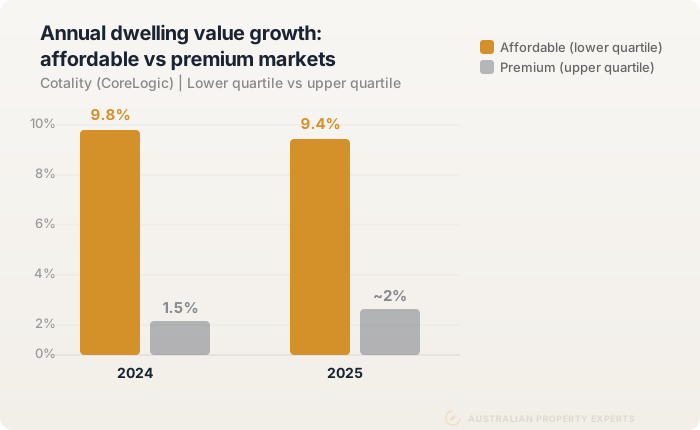
In 2024, the lowest quartile of dwelling values (the most affordable 25% of the market) grew 9.9% nationally. The upper quartile (the most expensive 25%) grew 2.1%, according to Cotality’s January 2025 chart pack. That’s not a small gap. The affordable end grew more than four times as fast as the premium end in a single year.
The trend continued through 2025. Cotality found the upper quartile grew more slowly in every capital city over the year. In the first four months of 2026, Sydney’s lower-quartile house values rose 2.9% while its upper quartile fell 3.3%.
Then the market turned, and the top end fell hardest. Over the three months to July, upper-quartile values fell 3.2% nationally while the lower quartile rose 0.3%. By August, upper-quartile houses were 10.7% below peak in Sydney and 10.5% in Melbourne.
The pattern has limits. The gap between upper and lower-quartile house declines is 6.6 points in Melbourne and 5.3 in Sydney. In Perth, Adelaide and Brisbane it is under one point. Canberra’s lower-quartile units have fallen further than its top-end units.
Cotality puts the split down to serviceability. Borrowing limits push demand toward lower price points, which concentrates buyer competition in more affordable suburbs. That drives prices up faster in percentage terms.
Melbourne is the clearest current example. Eight blue chip unit markets there pay yields between 3.75% and 6.19% and every one has gone backwards over five years.
Same returns, fraction of the price
The national data tells one story. Suburb-level comparisons make the gap obvious.
Perth: Armadale vs Cottesloe. Armadale has a median house price of $666,000. Cottesloe sits at $3,400,000. Over the ten years to June 2026, Armadale’s median rose 115% and Cottesloe’s rose 101%. Similar returns on a percentage basis, but Armadale took about one-fifth of the capital to enter.
Armadale’s path was rougher. Its median fell from $310,000 in 2016 to $200,000 in 2020, then more than tripled.
An investor who bought at Armadale’s median with a 20% deposit put in $133,200. The same position in Cottesloe needs $680,000 in deposit alone. Similar return rate. Dramatically different capital requirement.
Adelaide: Davoren Park vs Burnside. Davoren Park, one of Adelaide’s most affordable suburbs, has a median house price of $610,000 and has grown 237% over five years. Burnside, a premium eastern suburb with a median of $1,837,500, grew 98% over the same five years. The affordable suburb has grown more than twice as much. Over the latest year the gap is much narrower, with Davoren Park up 15.1% and Burnside up 12.9%.
Sydney: Western Sydney vs Mosman. In the year to June 2026, the St Marys median house price rose 16.7% to $1,200,000. Mount Druitt rose 7.3%. Mosman, at $5,300,000, fell 9.3% on 208 sales. Neither western suburb is low-priced any more, but both sit a long way below the top of the market.
Why premium markets fell hardest during rate rises
The 2026 rate rises have been the latest stress test. After three cash rate rises this year, the top end turned first. Cotality says higher-value homes in Sydney, Melbourne and Canberra were the first to fall and still record the largest cumulative falls.
Cotality ties this to elevated borrowing costs and serviceability limits. Buyers at the top end are stretching further relative to income, and when borrowing capacity shrinks, that segment feels it first.
Affordable markets have shown more resilience. When your mortgage is $400,000 instead of $1.5 million, a rate rise hits differently. On a 30-year principal and interest loan, a move from 2% to 6% adds about $920 a month on $400,000. On $1.5 million it adds about $3,450. Lower price points mean lower absolute exposure to rate movements.
This isn’t to say affordable markets are immune to downturns. They’re not. By August, Cotality reported lower-quartile values falling too, and the gap between the tiers is narrowing. Canberra’s lower-quartile units are down 2.9% from peak, against 1.6% for its top-end units. Still, premium blue chip suburbs are not the safe haven many investors assume them to be. Sydney’s upper-quartile houses are 10.7% below peak, deeper than the city’s 7.1% overall fall.
The yield gap is structural, not cyclical
Rental yield follows an inverse relationship with price. The lower the price relative to rent, the higher the yield.
Premium suburbs in Sydney and Melbourne typically yield around 2% gross on houses. A house in Brighton (Melbourne, median $3,250,000) renting for $1,495 per week delivers 2.39% gross. Mosman computes to 2.26% and Toorak to 1.62%. That’s before rates, insurance, maintenance, and management fees.
Affordable suburbs tell a different story. In western Melbourne, Melton South and Werribee houses compute to 3.81% and 3.70%. Werribee’s vacancy is 1.74%, but Melton South’s postcode sits at 4.64%. In western Sydney, Cabramatta and Canley Vale units yield 4.99% and 4.56%. Perth’s affordable corridor (Armadale, Gosnells, Cannington) yields 4.51% to 5.11% on houses.
The gap is up to double. Armadale’s $620 a week on its $666,000 median is $32,240 a year in rent. A 2.3% yield on a $2 million property generates $46,000, but requires three times the capital and three times the debt. The return on capital deployed is dramatically worse.
For a deeper look at how yield and growth work together in a portfolio, see our guide to capital growth vs rental yield.
Blue chip rarely delivers both growth and yield
This is the core problem with premium property as an investment strategy.
To scale a portfolio, you need growth to build equity for the next purchase AND yield to sustain holding costs so you can actually keep the properties. Blue chip suburbs almost never deliver both.
A property yielding 2% on a $2 million purchase earns $40,000 a year in rent. On an 80% loan at the 7.13% average discounted investor rate, interest alone is $114,080. That leaves you about $74,000 a year short before any other cost. You’re stuck funding a large shortfall indefinitely, hoping growth eventually compensates.
Armadale on the same loan terms looks very different. Its $32,240 of rent sits against $37,989 of interest, about $110 a week short before costs. Your borrowing capacity stays largely intact, and you can move to the next property sooner. Meanwhile, in the suburbs above, affordable markets are matching or beating premium ones on a percentage basis.
A portfolio of five or ten properties is hard to build from $2 million blue chip houses. It is far easier with $550,000 to $800,000 properties in affordable markets that deliver both growth and yield. The equity from each one funds the next.
More levers to pull: the optionality argument
There’s a structural advantage to affordable markets that doesn’t show up in growth or yield data.
When you buy an older, established property on a decent-sized block in an affordable suburb, you’re buying optionality. A $500,000 house on 650sqm gives you:
- Cosmetic renovation potential. Paint, flooring, kitchen and bathroom updates costing $30,000-$50,000 can add $60,000-$100,000 in value on the right stock. That’s a 12-20% lift on a $500,000 property. Try getting those economics on a $2 million property where the expected finish level is already high.
- Granny flat potential. Granny flats start from about $130,000. Rent one for $300-$350 per week and the total yield on that $630,000 outlay lifts from 5% to between 6.4% and 6.9%. That transforms the property’s cash flow and accelerates your path to the next purchase.
- Subdivision potential. A 700sqm+ block in the right zone can be subdivided down the track. The rear lot becomes a second asset you can sell or build on. You’ve just created equity out of dirt.
Premium blue chip properties on smaller, more expensive blocks don’t offer these levers. The land is too expensive to justify a granny flat build. The properties are already renovated. Subdivision isn’t possible on 400sqm in Toorak.
Affordable markets give you more ways to manufacture equity, not just wait for it.
Where the cycle sits right now
QLD, WA, and SA have run hard. Perth values rose 15.6% in the year to August and 79.7% over five years, per Cotality’s September index. Armadale alone was up 17.9% in the year to June. Adelaide’s affordable northern suburbs have more than doubled over five years. Davoren Park, Elizabeth North, Smithfield Plains and Munno Para all did.
These markets still have tight vacancy, but the easy gains from a low base are largely captured. Brisbane, Adelaide and Perth values have also started to fall from their autumn peaks.
VIC, TAS, and parts of NSW are earlier in the cycle. Melbourne values are 3.9% lower than five years ago, and Hobart’s are up 11.5%. Melbourne’s lower-priced end is holding up far better than its top end, with upper-quartile houses 10.5% below peak. Outer suburbs have posted the strongest recent growth, with Melton up 16.5% in the year to June.
For investors looking at where the next leg of affordable market growth comes from, these states start from lower entry prices after a weak five years. We put numbers to this in 19 investor purchases across 5 states, where affordable regional VIC kept growing even as the Melbourne aggregate turned.
Ran-hard and early-cycle markets both have a role in a portfolio. The regional markets guide breaks this down by location. The key is matching your entry point to where the cycle sits, not buying blue chip because it feels comfortable. If the best affordable markets are in another state, that’s where the data points. Our guide to buying interstate covers how to approach it. If you’d rather see real purchases than theory, our case studies show them.
The real risk is buying expensive
The conventional wisdom says blue chip is lower risk. The data says otherwise.
Upper-quartile houses in Sydney and Melbourne are more than 10% below their peaks in this downturn. The lower-priced end has fallen less, though it is now falling too. Premium yields sit around 2%, creating large holding cost shortfalls. Affordable yields of 4.5% to 5% come much closer to covering the loan. Premium properties concentrate your capital in a single asset. Affordable properties let you diversify across multiple markets.
Risk in property isn’t about the suburb’s prestige. It’s about your ability to hold the asset through cycles, your yield covering your costs, and your equity growing fast enough to fund the next purchase.
On each of those measures, the affordable suburbs above beat the blue chip ones for an investor building a portfolio. Price point also shapes how many properties you actually need to retire. The same number of properties in affordable markets generates far more retirement income than in expensive ones.
For a worked example of how far apart two towns at the same price can finish, see our Central West NSW comparison.
The weekly holding cost makes the same point in cash terms. We modelled what an investment property costs you per week, and Sydney runs $409 a week short before a single expense.
Data sources. Price-tier figures are Cotality commentary from its January 2025, January 2026, August 2026 and September 2026 releases, linked above. City changes are Cotality’s Home Value Index to 31 August 2026. Suburb medians, growth and sales are CoreLogic figures via Your Investment Property to 30 June 2026, with rents to 31 August 2026. Yields are computed as weekly rent times 52 divided by the median. Ten and five year changes compare June medians. Vacancy is SQM Research for August 2026. The investor rate is the RBA’s average discounted variable rate for August 2026. All figures pulled 26 September 2026.
This is general information only and not financial advice. Speak to a qualified professional before making investment decisions.
See how we target affordable markets with both growth and yield.
If you want to understand which affordable markets suit your budget and strategy right now, book a free discovery call.


_in_Dubbo,_NSW_2026_2.jpg)