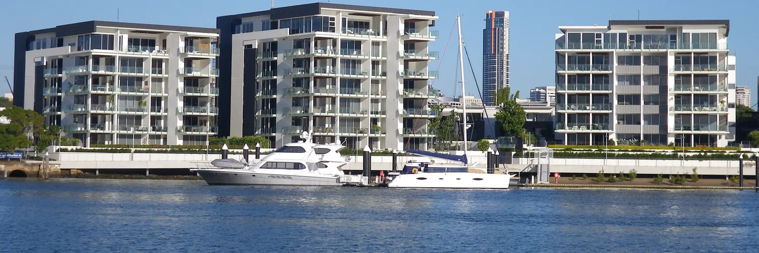
Every answer to this question online is a pros and cons list. Lower entry price. No lawn to mow. Strata fees. Less land.
None of that tells you whether the apartment in front of you will make money. So we measured seven Australian unit markets over the same ten years and looked at what separated them.
What apartments actually returned
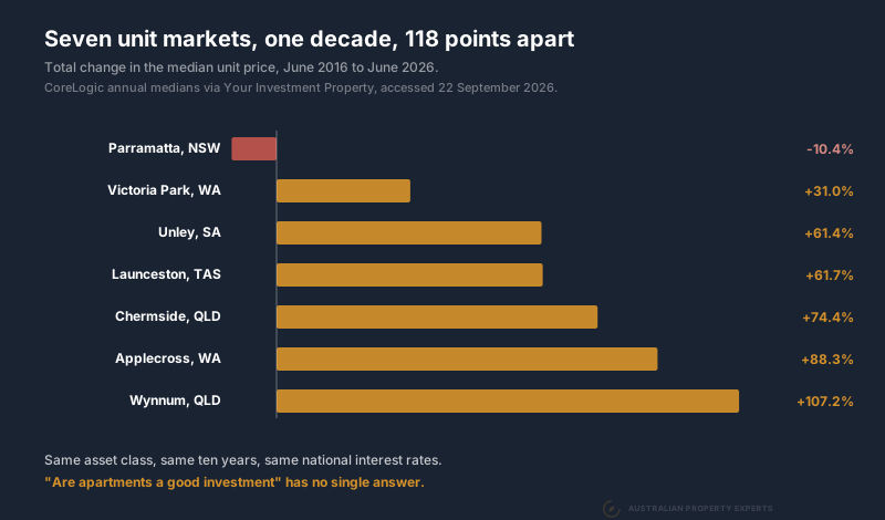
These are CoreLogic annual medians, June 2016 against June 2026, across four states.
| Market | Unit median 2016 | Unit median 2026 | 10 years |
|---|---|---|---|
| Parramatta, NSW | $695,000 | $623,000 | -10.4% |
| Victoria Park, WA | $458,000 | $600,000 | +31.0% |
| Unley, SA | $485,000 | $783,000 | +61.4% |
| Launceston, TAS | $341,000 | $551,500 | +61.7% |
| Chermside, QLD | $450,000 | $785,000 | +74.4% |
| Applecross, WA | $662,500 | $1,247,500 | +88.3% |
| Wynnum, QLD | $415,000 | $860,000 | +107.2% |
The spread between the ends is 118 percentage points. Same asset class. Same decade. Same national interest rates.
Some of that gap is the state cycle. Queensland and Western Australia have run hard for five or six years. Sydney units have gone sideways over the same stretch. A Brisbane number and a Sydney number are never a clean comparison, so that explains part of the table. It does not explain a median going backwards in nominal terms while the country’s dwelling values rose.
An average for “apartments” as a category is close to useless. Five things decide which end of that table you land on. You can check all five before you buy.
The cycle moves the answer
Split that decade in half and the same markets look like different assets.
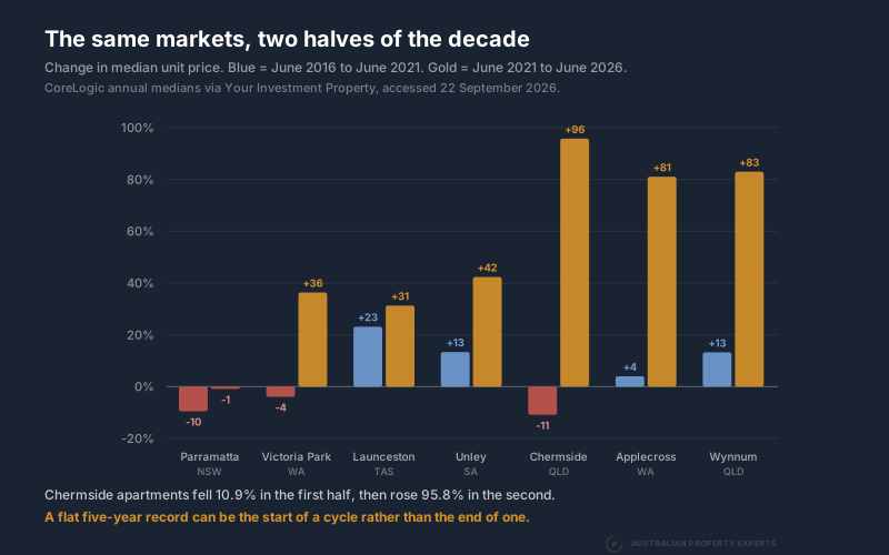
Chermside units fell 10.9% between 2016 and 2021. Over the next five years they rose 95.8%. Victoria Park went -3.9% and then +36.4%. Applecross went +4.0% and then +81.1%.
An investor looking at Chermside in 2021 would have seen a five-year record of going backwards in a high-rise suburb. That investor missed a near doubling.
Most of what changed was the state cycle. Queensland, Western Australia and South Australia have run hard since 2021 while Sydney units went sideways. Structure tells you how a market behaves when supply lands. The cycle tells you when.
So a flat record is ambiguous on its own. It can be a market with elastic supply that will stay flat, or a market that has been ignored and is about to move. The next three checks are how you tell those apart.
How many more can be built nearby
This is the test most investors skip. It does more work than the other two combined.
A house on land is protected by what it costs to replace. Nobody can undercut you while land plus construction costs more than you paid. Land is the scarce half of that sum and no planning decision creates more of it.
An apartment has almost no land under it once you divide the site by forty floors. Most of the cost is construction. More importantly, a rezoning manufactures dwellings out of thin air. Lift a site from three storeys to thirty and the same piece of ground produces ten times the homes, at a cost per home that barely moves.
That gives apartment supply a very flat response to price. Let prices rise far enough to make a tower stack up and the towers get built, which puts prices back where they were. The adjustment happens in the number of apartments rather than in the price of them.
Parramatta is the clearest worked example in the country. The Parramatta SA3 approved 17,206 apartments in fifteen years against 2,610 houses. Its median apartment finished the decade below where it started. Its houses rose 67.5%. The full working is in what a decade of supply did to Parramatta apartment prices, including the vacancy record and the pipeline still to come.
How to run this test yourself. ABS building approvals are free and published by small area. Search your target suburb’s SA3 in ABS Data Explorer. Pull dwelling units approved for apartments over the past ten years. Set that against the number of dwellings already there. Then read the council’s local housing strategy and the state housing target. If a precinct near you is mid-rezoning, that is your competition for the next decade.
Whether there is land under it
The word “unit” covers two completely different products. The approvals data shows how differently they get built.
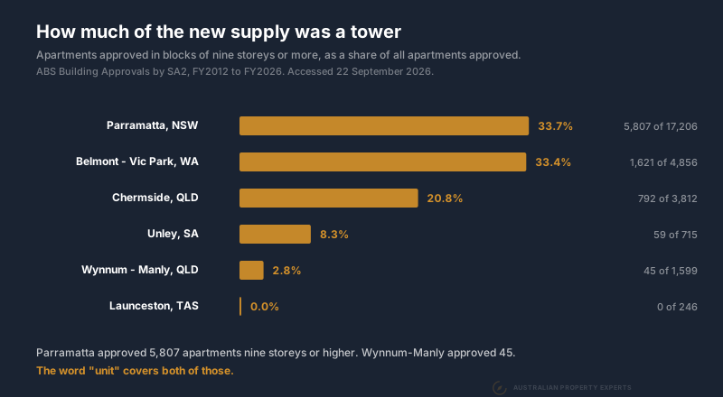
Of the 17,206 apartments approved in the Parramatta SA3, 5,807 were in blocks of nine storeys or more. In Wynnum-Manly the figure was 45 out of 1,599. Launceston approved none at all.
Take a villa unit on its own title. Single storey, a block of two to six, courtyard and a driveway. It has a real land component and a small body corporate. Nobody is dropping a thirty storey competitor onto that title arrangement. It behaves much closer to a house, which is why we buy them and avoid towers.
A one bedroom on level 14 is a different asset wearing the same word. Both appear in the same median. When somebody tells you units in a suburb grew 60%, ask which of the two they mean.
That distinction runs through the rest of the category. We set houses and units side by side over thirty years in house or unit, and the affordable end of the market against the premium end in affordable versus blue chip.
What the rent is doing
Supply is half the equation. The other half shows up in vacancy, and it moves before prices do.
| Market | Vacancy Aug 2026 | A year earlier |
|---|---|---|
| Chermside, QLD | 0.33% | 0.67% |
| Unley, SA | 0.40% | 1.07% |
| Victoria Park, WA | 0.72% | 0.84% |
| Launceston, TAS | 0.75% | 0.54% |
| Wynnum, QLD | 1.07% | 0.74% |
| Applecross, WA | 1.38% | 1.45% |
| Parramatta, NSW | 1.74% | 1.19% |
Parramatta is the loosest of the seven and the only one where vacancy has risen above 1.5%. Chermside and Unley both tightened hard over the year.
Direction matters more than the level. A market at 0.6% and loosening is telling you something different from a market at 1.2% and tightening. One reading proves nothing, so take two dates and compare them.
What the price gap tells you
Divide the median house by the median unit in the same suburb. That ratio is where the catch-up trade lives, and it is also where the trap lives.
Applecross houses sit at $2,500,000 against units at $1,247,500, a ratio of 2.00. Over the past twelve months its houses fell 1.96% while its units rose 35.52%. Buyers priced out of the house market moved down the ladder and the gap compressed.
Parramatta’s ratio is 2.58, the widest of the seven, and its units rose 0.48% over the same twelve months. A wide gap on its own is not a buy signal. We ran this across 38 Melbourne suburbs and the widest gaps had the worst unit growth, because a large discount usually reflects the stock rather than a bargain.
The gap is worth acting on when the other checks already stack up. A wide ratio in a market with tight vacancy, limited new high-rise and a house market that has already run is a very different setup from a wide ratio in a market with a rezoning underway.
What the body corporate takes
The third test is the cheapest to run and the one people skip because it is boring.
A gross yield of 5% on an apartment is nothing like 5% in your account. Body corporate fees come out of the rent every year. They rise over time. A building with a lift, a pool or a gym costs far more to run than a six-pack of villa units with a shared driveway.
Levies vary enormously building to building inside the same suburb. A suburb-level yield tells you nothing about the one you are buying. Get the last four quarters of levies and the sinking fund balance from the agent before you make an offer. We covered the typical numbers and what a healthy sinking fund looks like in body corporate fees.
High yield on an apartment often means the market has marked the price down for a reason the levies will explain.
Where apartments do work
Plenty of apartments have made money. Over the five years to June 2026, Chermside units rose 95.8%, Wynnum 83.0% and Applecross 81.1%. Those beat most Australian house markets over the same stretch.
The pattern in the ones that worked is consistent. New apartment supply in those suburbs is low-rise and limited. There is land or an own-title arrangement underneath them. Vacancy is tight and the state cycle was turning when the money went in.
An apartment can also do a specific job in a portfolio. If cash flow is the job, a unit yielding above 5% services itself in a way a $1.6 million house on 2.4% never will. Some portfolios are missing exactly that piece. Price it as an income asset and expect little from the capital, which is the trade-off in growth versus yield.
What we avoid is an off-the-plan apartment in a high-rise precinct with a live rezoning nearby. That combination fails four of the five checks at once.
Answering this for your own shortlist
Run the five checks in order. They get more expensive as you go. Approvals data and the storey split are free and take twenty minutes. Vacancy by postcode is free. The house to unit ratio is two numbers off the same suburb profile. The strata report costs you a phone call and tells you what the other four could not.
The answer is rarely a flat yes or no on apartments as a category. It is usually a yes on one market and a no on another, in the same year, for reasons all five of those checks will show you. Parramatta failed every one of them at once. Chermside passed enough of them in 2021 to be worth a look, at a point when its five-year record looked terrible.
Data sources. Unit medians are CoreLogic annual figures accessed through Your Investment Property, June 2016 to June 2026, pulled 22 September 2026. Dwelling approvals and the nine-storey split are ABS Building Approvals by SA2, financial years to June, accessed 22 September 2026. Yields quoted are computed as weekly rent times 52 divided by the median. Vacancy rates are SQM Research by postcode, August 2026 with the August 2025 reading alongside. Twelve-month growth figures are YIP’s published figures to June 2026.
This is general information only and not financial advice. Speak to a qualified professional before making investment decisions.
If you want the approvals pipeline and strata position on an apartment before you commit to it, book a free discovery call.


.jpg)